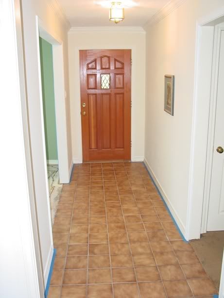
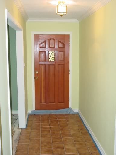
Here are some more realistic before and after shots of our foyer which I finally finished today (except for the inevitable minor touch ups which you won't notice in these shots).
Before:

After:

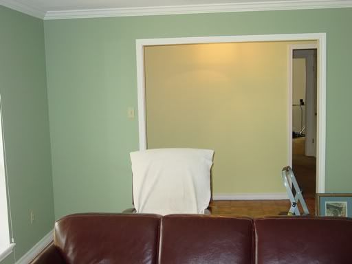
A contrast shot from the living room looking towards the foyer:

My flash tends to drown out some of the green and make this appear more yellow than it really is. It's definitely a mix of green and yellow though and I'm quite happy with it. The foyer was dull and uninteresting before, and now it seems to be an extension of the living room. I was a bit concerned with how the paint would work with those tiles, but I think it's fine. I'm happy.
Tomorrow I move on down the hallway to the bedrooms. My goal by the end of the weekend is to be done with the hall and both bedrooms. We shall see.

No comments:
Post a Comment