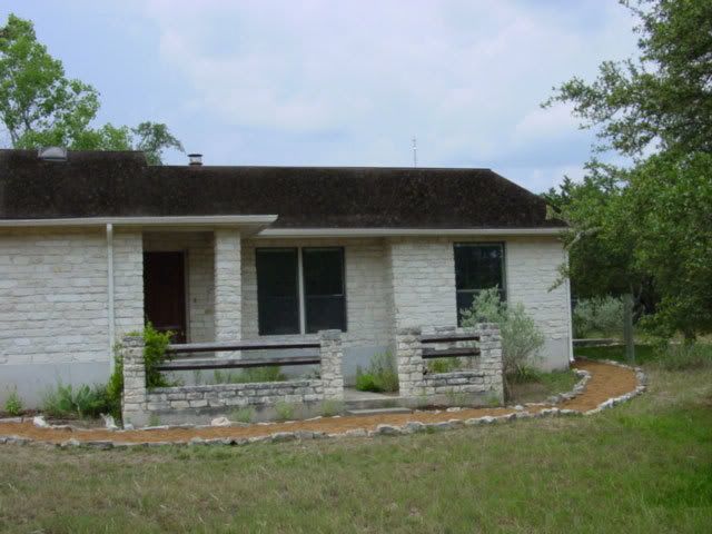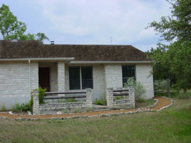
I think I'm still leaning towards #4 which was my original choice:

Here's a link to all 8:
#1, #2, #3, #4, #5, #6, #7, #8.
Take a look at #3 -- the red toned shingle. I liked that one as well but maybe a bit much? I like it but I'd have to go with a more neutral color for the siding on the back side of the house.

2 comments:
visit the website pop over to these guys go to my blog find more browse around this web-site Home Page
discover here replica designer bags Go Here gucci replica site here replica designer bags wholesale
Post a Comment